Tallo 2.0.
Redefining Education and Career Pathways
Empowering students, educators, and employers through a seamless, user-centered platform.

OVERVIEW
ROLE
UX/UI Designer
CONTEXT
Full platform redesign of Tallo for Stride, Inc.
TOOLS
Figma
Miro
Notion
Jira
TEAM
4 designers,
2 UX researchers,
3 product owners, 1 project manager
off-site dev team
TIMELINE
6 Months
Tallo is an innovative online platform designed to bridge the gap between students and talent-seekers by fostering a dynamic ecosystem where aspirations meet opportunities. The platform empowers students (ages 13 and up) to showcase their academic and technical skills, explore scholarships, and connect with colleges and employers.
The redesign addressed critical usability and engagement challenges, focusing on accessibility, responsive design, and human-centered solutions for two distinct user groups: students and recruiters.
My work on this project focused on redesigning critical features such as the Talent/Student Profile, Resume Builder, and Badging, as well as recruiter-focused features like Opportunities, Talent Search, and Analytics.

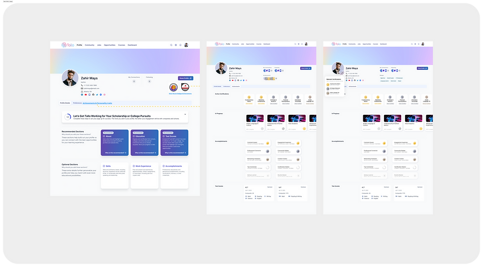
Revamped Profile
Simplified layout with progress tracking, clearer onboarding, and profile customization options.
Resume Builder
Provided guided templates, tooltip integration, and inline editing functionality.

TALENT SEEKER
Enhanced Talent Search
Enhanced search with robust filters (location, DEI, skill-based badges), and saved search functionality.


Streamlined Opportunities Hub
Easier job postings with structured templates and better categorization.
The Problem
Despite Tallo’s mission to connect students with opportunities, users struggled with friction points that hindered engagement and usability.
STUDENTS:
-
Profile completion was overwhelming – Students found the process tedious, especially with badge integration.
-
Resume building lacked guidance – Many users didn’t know how to structure resumes effectively.
-
Opportunities were difficult to navigate – Students had trouble finding relevant internships, scholarships, and job postings.
RECRUITERS:
-
Limited search & filtering – Employers needed better tools to discover top candidates, especially for diversity & inclusion (DEI) goals.
-
Lack of insights on hiring success – Talent seekers needed analytics to track outreach and engagement.
-
Underutilized Opportunities Hub – Posting job, internship, and badging listings was inefficient, leading to low engagement.
OVERVIEW
ROLE
UX/UI Designer
CONTEXT
Full platform redesign of Tallo for Stride, Inc.
TOOLS
Figma
Miro
Notion
Jira
TEAM
4 designers,
2 UX researchers,
3 product owners, 1 project manager
off-site dev team
TIMELINE
6 Months
Introduction
Tallo is an innovative online platform designed to bridge the gap between students and talent-seekers by fostering a dynamic ecosystem where aspirations meet opportunities. The platform empowers students (ages 13 and up) to showcase their academic and technical skills, explore scholarships, and connect with colleges and employers.
The Problem
The NIMHD website, vital for advancing health equity, had become a barrier to its mission. Users struggled with poor navigation, overwhelming content, and an outdated design that buried critical resources like funding opportunities and event information. Accessibility failures, including non-compliance with WCAG standards, further excluded key audiences, creating frustration and disengagement.
Behind the scenes, an aging infrastructure meant frequent errors, broken links, and inefficiencies in content updates. The site couldn’t keep up with modern expectations, and it wasn’t meeting the needs of the very people it aimed to support.
Audiences
We identified two primary user groups with distinct needs:
STUDENTS (TALENT):
-
Ages 13+, seeking scholarships, internships, and career opportunities.
-
Need an engaging and valuable platform to showcase their accomplishments and discover relevant opportunities.
RECRUITERS (TALENT SEEKERS):
-
Employers, universities, and organizations seeking early talent.
-
Require tools for filtering candidates, posting opportunities, and tracking ROI.
Goals & Success Metrics
The redesign focused on achieving the following objectives:
-
Connecting Students to Opportunities: Shift from GPA-focused metrics to a holistic approach that values individuality.
-
Improving User Engagement: Design an intuitive platform to encourage active use, profile creation, and participation in scholarships, jobs, and events.
-
Enhancing Talent Recruitment: Equip recruiters with advanced filtering tools and DEI-supportive features.
-
Building Brand Awareness: Enable talent-seekers to showcase their culture and opportunities while tracking ROI.
-
Creating a Holistic Ecosystem: Transform Tallo into a hub for career development, supporting student growth and readiness.
Solution
The redesigned NIMHD website effectively addressed the challenges identified during the discovery phase, delivering a platform that is modern, user-focused, and accessible.

The Solution
Tallo’s original MVP (called "New On Tallo") failed to meet user expectations, presenting key challenges:
For Students:
-
Revamped Talent/Student Profile:
-
navigation cumbersome, profile setup overwhelming, and the platform’s purpose unclear. The UI design did not appeal to this target user audience.
-
For Recruiters:
-
Needed better tools for managing job postings, filtering candidates, and tracking campaign ROI. Diversity, equity, and inclusion (DEI) initiatives lacked sufficient support in the platform.
Audiences
Students (Talent):
-
Ages 13+, seeking scholarships, internships, and career opportunities.
-
Need an engaging and personalized platform to showcase their accomplishments and discover relevant opportunities.
Recruiters (Talent Seekers):
-
Employers, universities, and organizations seeking early talent.
-
Require advanced filtering tools, intuitive job posting workflows, and actionable analytics..
Goals & Success Metrics
The redesign focused on achieving the following objectives:
-
Connecting Students to Opportunities: Shift from GPA-focused metrics to a holistic approach that values individuality.
-
Improving User Engagement: Design an intuitive platform to encourage active use, profile creation, and participation in scholarships, jobs, and events.
-
Enhancing Talent Recruitment: Equip recruiters with advanced filtering tools and DEI-supportive features.
-
Building Brand Awareness: Enable talent-seekers to showcase their culture and opportunities while tracking ROI.
-
Creating a Holistic Ecosystem: Transform Tallo into a hub for career development, supporting student growth and readiness.
THE PROBLEM
Design Question
How might we redesign Tallo to be an intuitive, engaging platform that aligns with user needs, fosters meaningful connections, and empowers students and talent seekers to achieve their goals?
The Solution
To address these challenges, I worked on designing intuitive, feature-rich solutions that improved usability, engagement, and recruiter success.
RESEARCH APPROACH
Discovery
To ensure our redesign addressed real user needs, we conducted qualitative and quantitative research:
-
Conducted user interviews and surveys with students, families, and recruiters to identify pain points and goals.
-
Analyzed usability gaps in the original MVP, focusing on profile completion rates, navigation issues, and recruiter workflows.
-
Benchmarked against competitors like LinkedIn and Handshake to identify best practices.
Insights & Findings
STUDENTS:
Overwhelmed by profile setup, particularly badging and progress tracking.
Requested clearer guidance and engaging features like personalization options
RECRUITERS:
Needed advanced analytics and filters for targeting diverse talent pools
Desired tools to track and communicate DEI efforts effectively
IDEATION
Ideation
User Flows and Wireframes:
We began by mapping out user flows to clarify key tasks, followed by iterative sketches and wireframes to visualize the platform’s layout.
Exploring Design Options:
-
For Gen Z students: Focused on bold, vibrant designs and gamified elements to increase engagement.
-
For talent-seekers: Developed a "MasterClass-style" professional interface, emphasizing clean layouts and data-driven tools.
Final Direction:
We selected the Untitled UI design system, which offered a middle ground between the previously used Tetrisly system and our users’ needs. This allowed for efficient design work while maintaining flexibility and consistency.

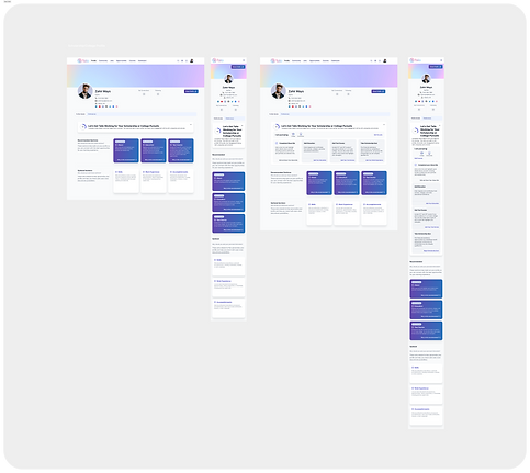
First New Student Profile Concepts
Audiences
We identified two primary user groups with distinct needs:
STUDENTS (TALENT):
-
Ages 13+, seeking scholarships, internships, and career opportunities.
-
Need an engaging and valuable platform to showcase their accomplishments and discover relevant opportunities.
RECRUITERS (TALENT SEEKERS):
-
Employers, universities, and organizations seeking early talent.
-
Require tools for filtering candidates, posting opportunities, and tracking ROI.
DESIGN PROCESS
Discovery
I applied a human-centered design approach to tackle these challenges, ensuring every decision was informed by user insights and iterative feedback.
To ensure our redesign addressed real user needs, we conducted qualitative and quantitative research, analyzing user feedback, platform analytics, and competitor benchmarks.
Prototyping
We moved on and built high-fidelity prototypes in Figma for critical features:
-
Talent/Student Profile:
-
Simplified progress indicators and added customization options like profile backgrounds.
-
Badging feature on Profile simplified.
-
-
Recruiter Dashboard:
-
Designed advanced analytics tools with DEI-focused filters and visualizations.
-
Badging opportunity options streamlined.
-

First New Student Profile Concepts
DESIGN PROCESS
Testing
We conducted multiple rounds of usability testing, uncovering valuable insights:
-
Dashboard: Rarely used; we simplified navigation to prioritize job and scholarship discovery.
-
Community Feature: Valued by students but lacked clear incentives and moderation tools.
-
Profile Completion: Students found it meaningful but difficult to complete; we refined the onboarding process to guide them more effectively.
Design Adjustments
Quick Wins Implemented:
-
Streamlined Jobs & Opportunities sections to enhance discoverability.
-
Refined badge integration and progress tracking in user profiles.
-
Improved Community engagement with better guidance and social incentives.
Student Profile
-
Redesigned the badging system and progress indicators for a smoother user experience.
-
Integrated dark mode for improved usability.


Resume Builder
Simplified resume creation with guided templates tailored to different goals.
Talent Search & Opportunities
Introduced AI-driven recommendations, robust filters (location, DEI, skill-based badges), and saved search functionality.


Opportunities
New predefined templates made it easier to create postings that aligned with student interests

Autono In Numbers
200
EMPLOYEES
200M$
CAPITAL
5
CORE TEAMS
326
PARTNERS
DESIGN PROCESS
Testing
WWe conducted multiple rounds of usability testing, uncovering valuable insights:
-
Dashboard: Rarely used; we simplified navigation to prioritize job and scholarship discovery.
-
Community Feature: Valued by students but lacked clear incentives and moderation tools.
-
Profile Completion: Students found it meaningful but difficult to complete; we refined the onboarding process to guide them more effectively.
Quick Wins Implemented:
-
Streamlined Jobs & Opportunities sections to enhance discoverability.
-
Refined badge integration and progress tracking in user profiles.
-
Improved Community engagement with better guidance and social incentives.
:
-
Talent/Student Profile:
-
Simplified progress indicators and added customization options like profile backgrounds.
-
Badging feature on Profile simplified.
-
-
Resume Builder:
-
Created guided templates and for various use cases (e.g., college applications or job-seeking).
-
Introduced inline helper tooltips as value props for content.
-
-
Recruiter Dashboard:
-
Designed advanced analytics tools with DEI-focused filters and visualizations.
-
Badging opportunity options streamlined.
-
Testing & Iterating
Prototyping & Testing
We moved on and built high-fidelity prototypes in Figma for critical features:
-
Talent/Student Profile:
-
Simplified progress indicators and added customization options like profile backgrounds.
-
Badging feature on Profile simplified.
-
-
Resume Builder:
-
Created guided templates and for various use cases (e.g., college applications or job-seeking).
-
Introduced inline helper tooltips as value props for content.
-
-
Recruiter Dashboard:
-
Designed advanced analytics tools with DEI-focused filters and visualizations.
-
Badging opportunity options streamlined.
-


First New Student Profile Concepts
Lessons Learned
Leading this project taught me the importance of:
-
Building a strong understanding of legal and technical requirements for government projects.
-
Constant communication and proactive collaboration to minimize delays.
-
Involving user feedback and testing earlier in the design process to balance stakeholder and audience needs.
Personal Growth as a Designer
This project ignited my passion for accessibility-first design and its role in fostering inclusivity.
It underscored that accessibility is vital not only for public-facing websites but for all digital products and experiences.