Tallo 2.0
Redefining Education and Career Pathways
Enabling students to connect their passions, talents, and interests with their perfect career.
ROLE
UX/UI Designer
CONTEXT
Full platform redesign of Tallo for Stride, Inc.
TOOLS
Figma
Miro
Notion
Jira
TEAM
4 designers,
2 UX researchers,
3 product owners, 1 project manager
off-site dev team
TIMELINE
6 Months

INTRODUCTION
Tallo is an innovative online platform designed to bridge the gap between students and talent-seekers by fostering a dynamic ecosystem where aspirations meet opportunities. The platform empowers students (ages 13 and up) to showcase their academic and technical skills, explore career paths find scholarships, internships, jobs through connecting with colleges and employers.
WHY THE REDESIGN?
Following Stride, Inc.'s acquisition of Tallo, an MVP redesign was attempted but struggled to take shape and failed to meet user expectations.
Our team was brought in last minute to work with the internal product development team, and was tasked with reimagining the platform from the ground up.
This lead to the development of Tallo 2.0—a complete transformation that enhances usability, engagement, and career development potential for students while providing valuable tools for recruiters.
MY ROLE
My work on this project focused on redesigning critical features such as the Talent/Student Profile, Resume Builder, and Dashboard, as well as recruiter-focused features like Opportunities, Talent Search, and Analytics.

PROBLEM STATEMENT
Despite Tallo’s vision to connect students with opportunities and recruiters with early talent, the platform struggled to deliver value for either group.
Students found the navigation cumbersome, profile setup overwhelming, and the platform’s purpose unclear. For recruiters, inefficient tools, limited filtering options, and a lack of insights into hiring campaigns hindered the recruitment process.
HOW MIGHT WE
redesign Tallo to be an intuitive, engaging platform that aligns with user needs, fosters meaningful connections, and empowers students and talent seekers to achieve their goals?
THE SOLUTION
To address these challenges, I worked on designing intuitive, feature-rich solutions that improved usability, engagement, and user success.

Revamped Profile
Simplified layout with progress tracking, clearer onboarding, and profile customization options.
Resume Builder
Provided guided templates, tooltip integration, and inline editing functionality.

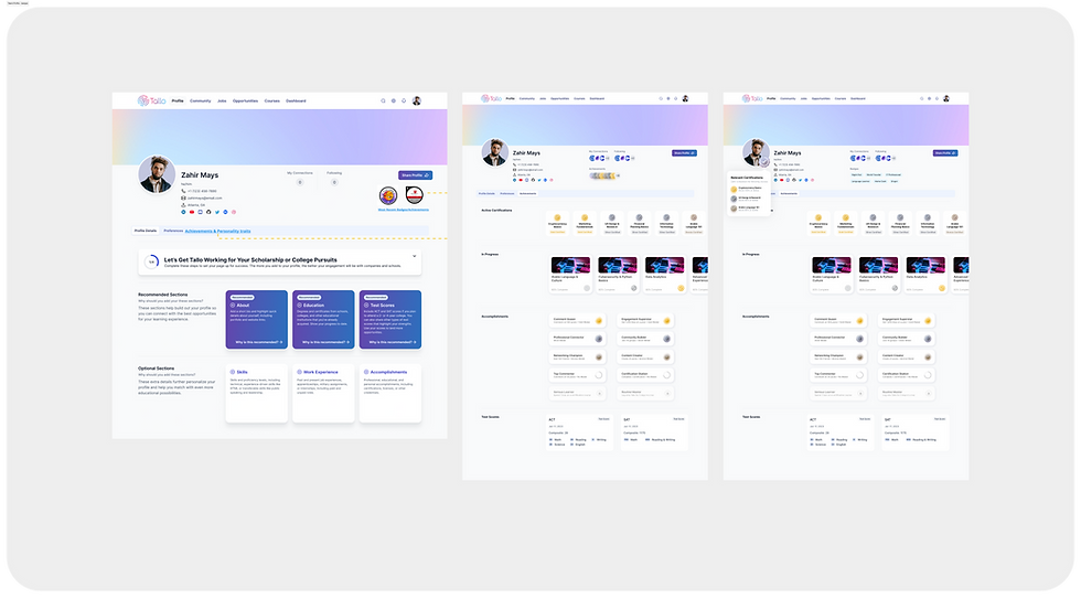
TALENT SEEKER
Enhanced Talent Search
Enhanced search with robust filters (location, DEI, skill-based badges), and saved search functionality.


Streamlined Opportunities Hub
Easier job postings with structured templates and better categorization.
THE PROCESS
We applied a human-centered design approach to tackle these challenges, ensuring every decision was informed by user insights and iterative feedback.
DISCOVERY
Research Insights
To ensure our redesign addressed real user needs, we conducted qualitative and quantitative research, analyzing user feedback, platform analytics, and competitor benchmarks.
WHAT USERS LOVED:
-
Students valued the ability to showcase their accomplishments, apply for scholarships, and network with peers, colleges, and employers.
-
Recruiters appreciated having access to a pool of young talent but needed better tools to search and evaluate candidates effectively.
WHAT NEEDED IMPROVEMENT
-
Unclear Navigation – Students struggled to discover relevant job postings, internships, and scholarships due to poor information architecture.
-
Cumbersome Profile Completion – Badging and resume-building features were tedious and unintuitive.
-
Recruiter Frustrations – Limited search tools and lack of analytics made talent identification inefficient.

First New Student Profile Concepts
PROFILE
STUDENT
"So far, the benefits have been informing about an internship I was able to get, allowed me to share my educational info with possible jobs/colleges, and has allowed me to keep all of my educational and similar info together for reference."
SIGN UP
STUDENT
“I think that making the account was hard to do. I had to go through a lot of different screens to just make an account."
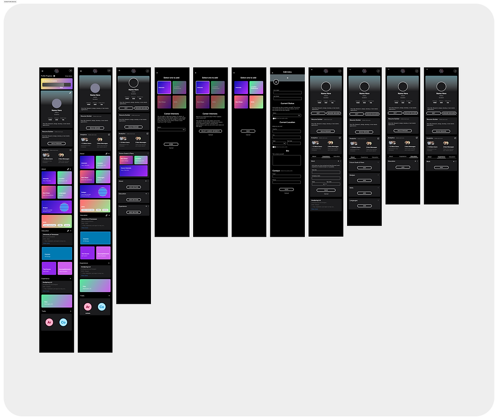
First New Student Profile Concepts
Insights & Findings
STUDENTS:
Overwhelmed by profile setup, particularly badging and progress tracking.
Requested clearer guidance and engaging features like personalization options
RECRUITERS:
Needed advanced analytics and filters for targeting diverse talent pools
Desired tools to track and communicate DEI efforts effectively
DESIGN
User Flows & Exploration
Our team mapped out key user journeys, identifying friction points and opportunities for streamlining the experience.
We iterated through sketches and wireframes to define the best layout and flow.

First New Student Profile Concepts
For Gen Z Audiences:
Focused on bold, vibrant designs and gamified elements to increase engagement.


For Recruiters (talent-seekers):
Developed a "MasterClass-style" professional interface, emphasizing clean layouts and data-driven tools.
Final Direction
We selected the Untitled UI design system, which offered a middle ground between the previously used Tetrisly system and our users’ needs. This allowed for efficient design work while maintaining flexibility and consistency.
Testing & Iterating
Prototyping & Testing
Built high-fidelity prototypes in Figma, focusing on:
-
Talent/Student Profile: Redesigned the badging system and progress indicators for a smoother user experience.
-
Resume Builder:
-
Created guided templates and for various use cases (e.g., college applications or job-seeking).
-
Introduced inline helper tooltips as value props for content.
-
-
Recruiter & Student Badges:
-
Designed enhanced, digital badging feature for both student and recruiter workflows.
-
Badging opportunity options streamlined.
-
Student Profile & Badging Iterationas

Badging Workflow Streamlined

Badging Workflow Streamlined
Testing & Iterating
Prototyping & Testing
Built high-fidelity prototypes in Figma, focusing on:
-
Talent/Student Profile:
-
Simplified progress indicators and added inline editing options for profile sections.
-
Badging feature on Profile simplified.
-
-
Resume Builder:
-
Created guided templates and for various use cases (e.g., college applications or job-seeking).
-
Introduced inline helper tooltips as value props for content.
-
-
Recruiter & Student Badges:
-
Designed enhanced, digital badging feature for both student and recruiter workflows.
-
Badging opportunity options streamlined.
-
Student Profile & Badging Iterationas

Badging Workflow Streamlined
Prototyping & Testing
Design Execution:
After finalizing the wireframes, I transitioned to designing high-fidelity mockups using the U.S. Web Design System (USWDS) as the foundation. Components were customized to align with NIMHD’s branding while maintaining consistency and usability.
To do this quickly and accurately, I utilized atomic design methodology in all my style & component brand customization as I built NIMHD's child-design system. I also used many of the government provided resources online for modernization work, especially the USWDS Color Tool from CivicActions.
I followed the same order as the wireframing process, starting with the homepage and moving to section landing pages and subpages. Each mockup was carefully designed to balance functionality, branding, and accessibility.

Design System Colors
Collaboration & QA
Throughout the implementation, I scheduled regular check-ins with developers and team members to:
Ensure the designs adhered to functional requirements and project scope.
Identify and resolve any violations or deviations from USWDS guidelines.
Validate custom components or UI elements to maintain WCAG AA standards and Section 508 compliance.
Challenges and Solutions
During this phase, stakeholders expressed dissatisfaction with the initial high-fidelity designs, requiring significant changes to the styled UI and branding. Leveraging atomic design principles allowed for rapid iterations, enabling the creation of three new UI style options. This approach streamlined updates across the design system while maintaining consistency and compliance.

Design Iteration #1

Design Iterations #2, 3 & 4
Key Achievements
-
Search Functionality: Improved content discoverability through enhanced search features, including filters and categorization, designed for a seamless user experience.
-
News & Events Section: Simplified user journeys by reducing clicks, improving organization, and creating visually engaging layouts tailored to audience needs.
Accessibility & Compliance
Accessibility compliance was ensured through rigorous testing using online tools and government-recommended resources. Adhering to USWDS guidance, the redesign met WCAG AA and Section 508 standards, providing an inclusive experience for all users.
FINAL OUTCOME & REFLECTION
Final Design
-
Accessibility Compliance:
-
Eliminated all WCAG AA standard violations.
-
Achieved full Section 508 compliance.
-
-
Responsive Design:
-
Delivered a mobile-first design approach for seamless cross-device experiences.
-
-
Stakeholder Satisfaction:
-
Stakeholders praised the final designs, particularly the integration of content blocks for the Drupal CMS.
-
Though the project was still ongoing when my role concluded, these achievements provided a strong foundation for usability testing and launch.

Responsive Redesigned Homepage

Mobile First Design Highlights

News Section Redesign

News Article Page Design

Redesigned Megamenu
Lessons Learned
Leading this project taught me the importance of:
-
Building a strong understanding of legal and technical requirements for government projects.
-
Constant communication and proactive collaboration to minimize delays.
-
Involving user feedback and testing earlier in the design process to balance stakeholder and audience needs.
Personal Growth as a Designer
This project ignited my passion for accessibility-first design and its role in fostering inclusivity.
It underscored that accessibility is vital not only for public-facing websites but for all digital products and experiences.